
The below report is exceedingly granular, and in some crucial ways it is interpreting the horrific data through a measured and conservative lens; in other words, the questionable government datasets are in some ways being downplayed.
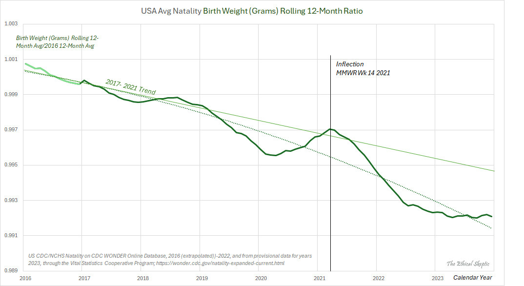
There are a pair of links in the below report that refer to two significant graphs, and I would like to call your attention to the possible developing trends that need to be carefully tracked going forward; to wit:
US Natality Birth Weight:
US Infant Not Alive at Time of Natality Report:
Note that the above data is courtesy of the Center from Disease Crimes (CDC), and the National Center for Health Statistics (NCHS); thus, extrapolate accordingly.
This is the much anticipated ‘Houston We Have a Problem (Part 3 of 3)’ article.
A summary of excess mortality in the United States: A comprehensive analysis for Week 6 of 2024 – marking the 206th week of the SARS-CoV-2 Pandemic. This article provides an in-depth examination of various factors contributing to increased mortality rates, including an assessment of the primary causes. Despite facing challenges in visibility due to varying degrees of allowance and dissemination across platforms like Apple, LinkedIn, YouTube, and Facebook, this analysis strives to present an unbiased, evidence-based perspective on this excess mortality.
As of Week 6 of 2024, 3.96 years into the Covid-19 Pandemic and its aftermath, 1,625,842 excess deaths have been recorded to date. Now certainly, the SARS-CoV-2 virus was a deadly pathogen, itself 6.6 times more deadly than the typical annual mortality total for all influenza viruses combined. However, as the reader will infer from the material below, it was the panic-fueled, and in some cases malicious, actions of those few in power which have served to precipitate the larger part of total excess mortality during the pandemic, as well as post-pandemic, periods.
As of February 10th 2024, there have been
706,036 Excess Non-Covid Natural Cause Deaths (primarily from the Covid Vaccine),
176,870 Excess Non-Natural Deaths (including sudden cardiac deaths in casual drug users),
374,369 Excess Deaths from Malpractice and Denial of Treatment,1
368,567 Excess Deaths from the SARS-CoV-2 virus (6.6 x annual influenza-pneumonia)2
making for a grand total of 1,257,275 Manmade Excess Deaths of US Citizens, out of a Pandemic Total Excess Mortality of 1,625,842.
Background
A wide diversity of ‘Omicron’ variants were discovered to have been percolating throughout global populations in 2021 (we contend that the mutation rate, the immediate high genetic diversity, as well as the genetics themselves indicate circulation since 2017), featuring a Case Fatality Rate which turned out to be curiously on par with the well-established annual HCoV and flu mortality benchmarks (a metric of human frailty as opposed to necessarily just pathogen virility). This far lower CFR of 1.1 to 6.6 (also corroborated by means of CDC data in Chart 1) versus Wuhan-Alpha-Delta strains is substantiated by the Our World in Data dataset, and can be seen in Exhibit A below.
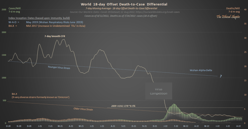
As one may observe, ‘Omicron’ is about half as deadly as was the 2009 H1N1 flu. It arrives amazingly at a CFR of about the level of a normal year’s influenza and pneumonia.
Therefore, something else is behind the non-Covid excess natural cause deaths of our younger citizens which began in mid 2021 (and it is not Covid-19, Long-Covid, lockdowns, nor fentanyl).
Notice that public health authorities never cite this. Notice as well, how they avoid the implication that the diverse set of ‘Omicron’ strains were the most likely candidate to have produced Pacific Asian immunity to Wuhan-Alpha-Delta (and not their ‘lockdowns’, which thereafter showed to be ineffective beginning with 2022 strains in Asia – amazingly right on time for the well established four-year HCoV mutation/infection cycle).
Thus, it became increasingly clear throughout our analysis that most of the globe (having already been exposed to lower-mortality proto-Covid variants) fared Covid-19 relatively well because of the advance immunity imparted in the years prior to the official pandemic. Moreover, that disruption, lockdowns, iatrogenics, denial of treatment, along with our quod fieri final solution, have collectively served to kill the majority (namely 1,257,275 or 77.3%) of the US Citizens who died during the 206 weeks of the pandemic and its aftermath thus far. It is clear, despite the original danger presented by the Wuhan through Delta variants of the SARS-Cov-2 virus, that this circumstance quickly escalated into a man-made tragedy within the United States and other Western nations.
USA Nominal Excess All Cause Mortality – 7.5%
The beige line in the chart below shows the actual CDC Wonder deaths per week for the two years prior, as well as years-of and years-post the pandemic. The dark orange baseline is normalized from the years 2014-2019, representing a 1.4% annual growth in mortality for the US in terms of all causes. This 6-year baseline reflects a balance between a retrospective lengthy enough to provide statistical significance, but not so long as to be confounded by generational effects or immigration impacts.
Please note that we do not employ the incorrect terms/metrics ‘crude mortality rate’ and ‘age-standardized mortality rate’ (Chart 2 outlines our terms and metrics). These indices are used to compare death rates between nations in a normal circumstance, not for a retrospective impact of a black swan event inside a single nation.3 This is an essential element of professional competence.

This chart of course, reconciles with each of the other charts inside this system reporting summary article. We track this system coherency each week to make sure that the entire set of metrics agree with one another.
Modeling a system is like driving a car or conducting a symphony. One is comparing hundreds of inputs for consilience in development of a dynamic description of reality. Everything must work in concert and/or agree. Cursorily scanning the side-view mirror on GitHub, and quibbling with people who have never driven a car in their life, over whether that was a truck or a smudge on the glass, is irrelevant and unproductive. A mere exercise in wanna-be ego.4
This article presents a dynamic systems analytics argument. This is not ‘statistics’. The mission therein resides in detecting signal, not comparing batting averages or political candidate approval ratings on a simple spreadsheet.
When professional systems engineers replicate this work, they corroborate the answers therein.
When professional actuarials replicate this work, they corroborate the answers therein.
I do corroborate or falsify my various model conjectures (you don’t see the hundreds which showed as invalid), in the form of retrospective, derivative, cross section, spanning tree, delta-sensitivity, constraint reference testing, and comparative analyses – and not through wasting precious time in trivial arguments with inexperienced pretenders under extreme agency or bias. After all, this is what a systems professional naturally does – one who is used to having their work be subjected to intense scrutiny by knowledgeable client stakeholders as opposed to angry ad hominen focused pretenders.
Time renders the truest of peer review, surpassing the collective savvy of all experts.
If one uses only raw data to craft these charts they will always get a wonderful-looking trend in death. Back when Covid cases were varying highly by season, in a quarter where the case trend ended below the pandemic line, did that mean that the Pandemic was over? No. The same principle applies here then, one cannot use mere raw data (especially one stand alone metric) to draw inference. In general, there are six adjustments or exclusions/inclusions one need make (depending upon the data scraped/linked) to raw data obtained from the CDC/NCHS:
Weeks -1 to -12 for state reporting lag
Weeks -1 to -25 for RXX (abnormal findings) hold shortfall/overage (depends upon ICD code)
Weeks -1 to -33 for 999 (non-natural suspected) hold shortfall/overage (depends upon ICD code)
Weeks -12 to -33 for erosion from ICD reassignment by CDC
Weeks -12 to -33 for erosion from UCoD to MCoD reassignment (see Chart 5) by CDC
Pull forward effect adjustment (see Chart 3b) of the baseline deaths anticipated for 2021 through 2027
All of these adjusts are either marked on the charts below, or are outlined as to how they are obtained, in a separate chart. If an analyst does not track these confounders faithfully and weekly over time and compare their relative impacts in terms of a total system, or if they dilute a signal through growth by a population which does not exhibit the mortality in question – mortality inflections and trends will be diluted – suggesting an entirely wrong (rosy) short term result. The bad news will only show up in the data years later. Of course, this is the actual plan.
That being said, let’s now examine the various metrics of excess mortality as of week 6 of 2024.
Balance Sheet – USA Excess All Cause Mortality – 11.0%
When examining excess mortality metrics and considering them in the context of the broader summary of excess mortality, the resulting balance sheet (shown in Chart 2 below) is derived. A crucial distinction between systems analytics and mere ‘statistics’ resides in the requirement for systems dynamics to comprehensively depict an entire schema of interdependent relationships, in terms of both end-to-end agreement and coherence. Such systems engineering expertise and rigor characterizes both my academic foundation as well as my five-decade-long professional career. Such exemplifies as well the distinction between a hack or journeyman technician, versus a real scientist.
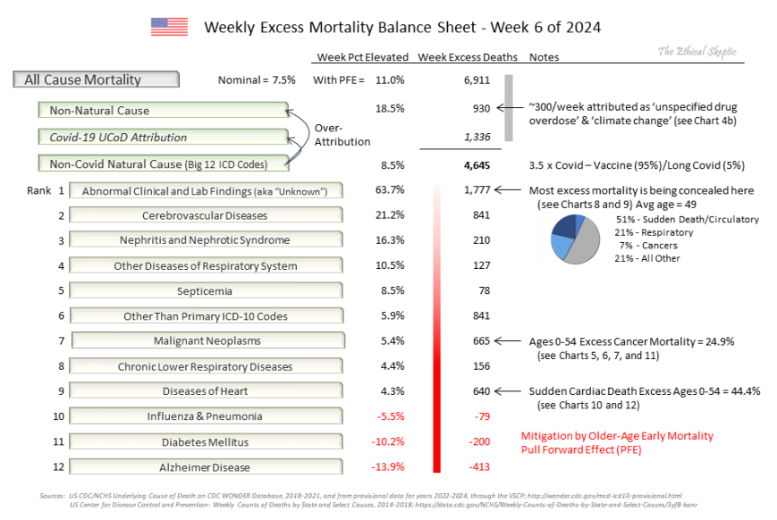
The reader should note that the CDC eliminated reporting of the Big 12 ICD categorizations (their Morbidity and Mortality Weekly Report) at the end of September 2023. This data set was useful in helping spot anomalies (‘pull forward effect’ for instance) in the rates of death in the US, and in preventing paltering and torfuscation of the baseline in order to make later years appear to have less excess death. To this end, below are the five dishonest tactics employed by fake analysts and pharmaceutical narrative science advocates:
Paltering (boosting the baseline) – crafting a baseline inflated by rolling or factored-in 2020-23 excess deaths.
Torfuscation (hiding the bodies in the bog) – failing to adjust 2021-2027 baseline downward by pull forward effect (PFE).
Simpson Per Capita Dilution (diluting signal with non-salient ‘population growth’) – making per capita or per-100K adjustments to a signal in a subpopulation
which has had its candidate population shrink and not grow (over age 75 for example, post pandemic),
for which the population growth bracket-profile does not match the profile/death risk of the group from which the signal has been extracted (eg. immigration-influenced growth applied to ‘heart disease’, ‘cancer’, or ‘Alzheimer’s’),
for which the analysis is crafted to detect a short retrospective inflection/excess and not a generational trend,
where the growth trend line itself already reflects the rate of population growth inside its historic metric,
using population projections made prior to a black swan event (Covid-19), or
employing migrant-fueled population growth rates.
Gaussian Blindness – the warning flags of a data charlatan:
Applying linear regression analysis across an entire non-linear, depleted, or inflected data set.
Employing a linear trend line when a dynamic baseline is the professional standard for signal analysis.
Depiction by means of a ‘quashed-y’ or ‘zero-base’ chart combined with a linear regression on a high magnitude data set.
Depiction by ‘quashed-x’ or a cherry picked time axis such that an inflection is concealed behind a conveniently selected regression line and time frame, which both shows the trend desired and/or hides the signal in question.
Age-Standardized/Crude Retrospective Analysis – employing age-standardized analysis to a retrospective analysis of one nation during a black swan event, when age-standardized analysis is used for comparing metrics between nations during a normal circumstance.5
~ The Five Cheats of Covid Narrative Science
These data magic tricks are not merely unethical, but when enacted by public health authorities, are also immoral. Just as in the case of their refusal to release V-Safe data, vaccine cohort data, or spurious VAERS record disappearances, data sets effective in targeting the harm introduced by the Covid-19 mRNA vaccine are all being systematically screened from public access. These are human rights crimes.
Beware he who would deny you access to information, for in his heart, he dreams himself your master.
Accordingly, we put together a scrape which assembles the same data from Wonder, as one used to be able to obtain from the CDC Weekly MMWR Report, so that we are able to continue this tracking (that is, until they eliminate Wonder altogether and simply appeal to tyrannical authority in its absence). We also have kept a backup of the old MMWR data to show how the CDC palters the baseline in the years to come.
The following charts all feed systemically into and reconcile inside the summary balance sheet above.
USA Excess Non-Covid Natural Cause Mortality – 8.5% (4-sigma)
The beige line in the chart below shows the CDC Wonder Excess Non-Covid Natural Cause deaths per week for the two years prior, as well as years of and years post the pandemic. The dark orange baseline is normalized from the years 2014-2019, representing a 1.12% annual growth in mortality for the US in terms of all non-Covid natural causes. Just as in the case of all this specie of charts, the 6-year baseline reflects a balance between a retrospective substantial enough to provide statistical significance, but not so long as to be confounded by generational effects or immigration impacts.
Understanding the Pull Forward Effect (demarcated as ‘PFE’ in orange), represented by the reduced orange baseline observed in Chart 3 from 2021 onwards, is crucial when evaluating Excess Non-Covid Natural Cause Mortality, as well as in actuarial and epidemiological studies more broadly. This is because the combined effects of excess mortality and temporary decreases in mortality following a pandemic can offset each other, a phenomenon known as the Simpson effect, leading researchers astray. This has been evident in the analysis of the Covid-19 pandemic, where analysts have consistently arrived at incorrect conclusions about the relationship between the vaccine and excess mortality due to a lack of understanding in addressing this aspect of the data.
Understanding the Morbidity and Mortality Weekly Report for Week 14 of 2021 is crucial for grasping the dynamics of Excess Non-COVID Natural Cause Mortality. This specific week marks the period of most rapid administration of both doses of the COVID-19 vaccine. Upon analyzing numerous charts illustrating etiological and causal influences, it becomes evident that this particular date consistently emerges as a notable turning point.
Two prime illustrations of this vaccine inflection date impact can be observed in the US Natality Birth Weight Chart and the US Infant Not Alive at Time of Natality Report Chart. The Procedure for development of these charts can be found by clicking here.

Please Note: This mortality set identified in Chart 3 is being artificially depleted by the CDC/NCHS during post-lag weeks -13 through -33. Those deaths being removed from this chart are being inserted as ‘unspecified drug overdoses’ (see Charts 4 and 4b below) and ‘climate change’ deaths inside Non-Natural Mortality. This equates to a missing 60,000 deaths falsely ascribed to overdose and climate as the underlying cause (UCoD) since March of 2021.
Perhaps the only good news to be found within Chart 3 above is the flattening in this Excess Mortality trend for most of the year 2023. However, we have documented (in Charts 3b and 8) that this is simply an impact of the pull forward effect (because of our conservative choices with regard to its metrics), so we will watch how this excess trends over the outyears in order to discern what is indeed occurring.
No Sympathetic Variance Between Excess Non-Covid Natural Cause and Covid-19 Mortality
The question therefore arises: “Is the arrival of each week’s Excess Non-Covid Natural Cause Mortality simply a case of ‘missed Covid-19 deaths’?” The answer to this question is an unequivocal ‘No’. In Chart 3b below, one can observe the progressive loss in covariance between Covid Mortality and Excess Non-Covid Natural Cause Mortality across the retrospective horizon. Basically 3 phases of covariance progression between the two metrics exist:
Significant Relationship (Mar 2020 – Jul 2020) – the timeframe wherein the two indices behaved with extreme covariance during the period before comprehensive PCR testing was in place. Indeed, during this timeframe many Covid-19 deaths were missed and not counted.
Slight to No Relationship (Aug 2020 – Mar 2022) – during this period, the relationship between the two metrics all but disappears. A slight sympathy develops as Covid begins to shift its mortality to the more traditional Nov – Feb high mortality timeframe for all death ICD codes (the scalloping shown in Chart 1 above). This creates a pseudo-trend in relationship between the two metrics (yellow dotted regression line), which is not real. In other words, this is Covid-19 Mortality becoming more conformant with natural cause death patterns (see Chart 1), than it is Excess Non-Covid Natural Cause Mortality becoming conformant with Covid-19 deaths.
No Relationship Whatsoever (Apr 2022 – now) – since the arrival of the diverse set of ‘Omicron’ variants of Covid, there has existed zero relationship between Excess Non-Covid Natural Cause Mortality and Covid-19 Mortality.

Accordingly, there has existed little to no sympathetic statistical relationship between Excess Non-Covid Natural Cause Mortality and Covid-19 Mortality since the introduction of widespread PCR testing in mid-2020. Excess Non-Covid Natural Cause Mortality is not a case of ‘missed Covid-19 deaths’.
Pull Forward Effect (PFE)
Pull Forward Effect (PFE) – when in a given population, a large number of older citizens (in the case of Covid-19 an average age of 82 years) die to the excess in a given short timeframe, due to an exceptional cause (famine, war, pandemic, terror) – then the baseline death rate for that population must be lowered by a function of that excess death for an actuarial-derived period thereafter.
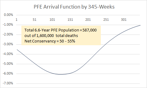
The function we currently use for PFE is described by 6.6 years (345 weeks – April 2021 – Oct 2027) of Chi-squared arrival, with an anticipated x_mode (function peak) of mid-late 2023 at 6.02% of Excess Non-Covid Natural Cause Mortality. Only 587,000 of the net 1.3 million older person deaths are claimed inside this entire PFE function. The arrival argument is depicted to the right, as well as in this PFE Reference and Calculation Basis Chart.
Therefore, the conservancy we employ is on the order of 50 to 55%. The actual PFE is more than double that used in our models. We presume for all intents and purposes that 700,000 of these 1.3 million older-citizen Covid-19 deaths ‘would have lived forever’. Such highlights the ridiculous levels of conservancy we have gone to in order to appease pretend critics.
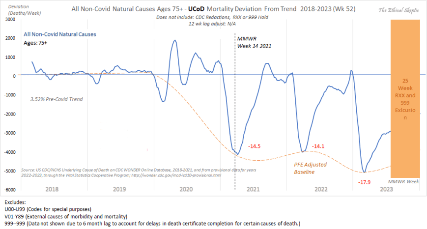
The basis of our pull forward effect (PFE) calculations can be seen by examining the dip-to points in the DFT Chart (3b) below, which shows clearly the 2021-2023 shortfall trend in All Non-Covid Natural Cause Mortality for ages 75+. The older-citizen sensitive Alzheimer (G30) ICD mortality and Dementia and Related mortality trends over this same period are suitable for confirming this pull forward effect deficit (both show trough points in April 2023). The pull forward effect can be seen as well in the MMWR/Wonder data on the Primary 11 ICD Mortality codes (5.9% in 2023) and in the November 2023 Society of Actuaries Mortality Survey Report. (8% at 2023 peak in oldest age brackets). Collectively, they substantiate our 6.02% drop (at peak, mid-2023) in baseline expected for Excess Non-Covid Natural Cause Mortality (seen as the baseline adjustment in Chart 3 above, and in Chart 6 below).
Resulting Covid-19 Vaccine Negative Cost-Benefit Function
In terms of US county-by-county arrival of this Excess Non-Covid Natural Cause Mortality, the heaviest concentrations of this death group has been in the most highly vaccinated counties in the US. In the dynamic analysis shown in Chart 3c below, one can see that this Excess Non-Covid Natural Cause Mortality both begins solely after the rollout of the vaccine nationwide, and as well bears its heaviest impact in those counties which are most heavily vaccinated. One cannot use state level data for this because of Hope-Simpson effect during the Delta variant timeframe (a competence flag in those showing such regressions) hitting south border states most heavily. This serves to impart a misleading Yule-Simpson effect in the state level data. Only county-level data is salient.
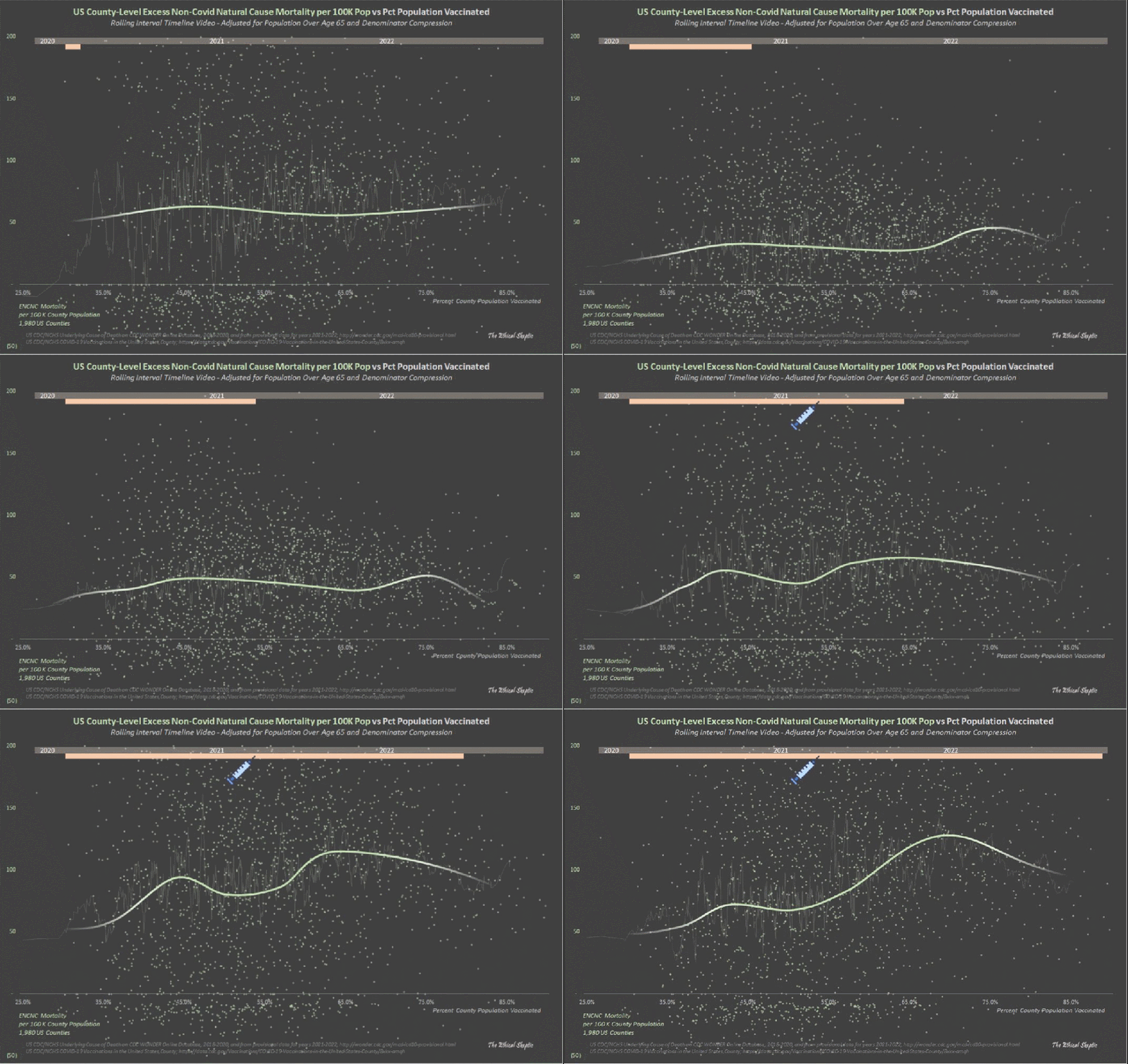
Despite this mRNA vaccine associated death quotient by US County (Exhibit 3c), the Covid-19 vaccines had no appreciable impact on Covid Mortality when analyzed by US County (Exhibit 3d below). Please note that US State level data is compromised (Yule-Simpson Effect) by Hope-Simspon Effect (seasonality by latitude for a virus) and the timing of the arrival of the Delta variant. For this reason, do not trust anyone who touts state level data.
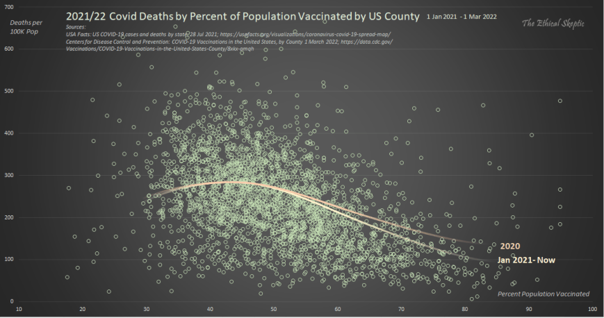
A purported vaccine efficacy signal only showed in small sample hospitalization studies sponsored by the CDC. Lots of unvaccinated persons went to the hospital, but curiously they never showed up in the mortality totals. Statistically this is impossible. Moreover, when the CDC small study sample ratios are expanded to the entire population, the result is a severe overage in total mortality. Both of these falsifications bring the CDC Covid-19 Response, Epidemiology Task Force study integrity into question.
USA Excess Non-Natural Mortality – 18.5%
The beige line in the chart below shows the CDC Wonder Excess Non-Natural Cause deaths per week for the two years prior, as well as years-of and years-post the pandemic. The dotted baseline is normalized from the years 2014-2019, and comprises a 1.42% annual growth in mortality for the US in terms non-natural causes. This reflects excess mortality from unsound lockdown and open border practices, in terms of suicide, addiction, assault, accidents, abandonment, and despair (SAAAAD). Disruption (loss of access to medical services or medications) deaths are now included inside iatrogenic and denial of treatment tallies (medical mistakes).

It is our hope that the downward trend in this metric since mid-2021 continues until this mortality recovers its baseline. The sudden jump which occurred in mid-late 2023 is something we are watching. Just shy of half of this sudden jump is from spurious climate related heat attributions.
However, it is also important to note that many of the excess deaths being attributed to Non-Natural Causes above, are actually from vaccine-induced myocarditis. The proof of this can be seen in DFT Chart 4b below.
As can be ascertained from this chart, there exists absolutely no doubt concerning the relationship between the vaccine and excess death. The most impactful influence upon ‘unspecified drug overdose’ and ‘climate change’ mortality in younger persons, is the introduction of the Covid-19 vaccine. This is also confirmed by the Sudden Cardiac Death Mortality for ages 0-54 shown in Chart 10.

USA Excess Cancer Mortality – 5.3% (9-sigma) with Novel 2.0% CAGR
The green-to-red line in Chart 5 below shows the CDC Wonder Excess Attributions of underlying cause of death Cancer to multiple cause of death Cancer, per week for the two years prior, as well as years-of and years-post the pandemic. The dotted baseline is normalized from the years 2018-2019, and indexed to the last 7 week average as compared to those same 7 weeks of 2018/19, so it is not a ‘regression’. Since this is a relative index, it should exhibit no trend or growth rate (outside the context of Covid mortality peak periods of course). The current excess of 300 deaths reflects cancer deaths which are concealed from the underlying cause of death ICD code, and must be added back into the mix in order to make Excess Cancer Mortality comparable to its past baseline. We reconcile this into Chart 6 below, applying it only after the pandemic period ended.
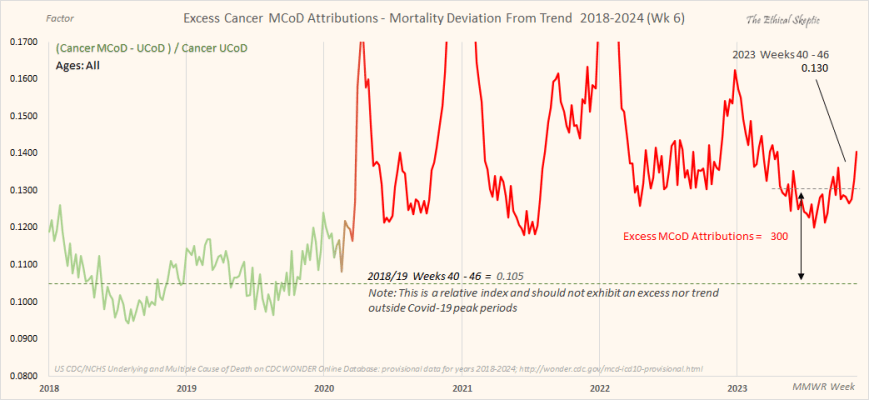
When done correctly and ethically, cancer shows a clear inflection in growth rate at Week 14 of 2021 – the week of fastest uptake in the mRNA vaccine within the US population (as can be seen in Chart 6 below). In fact, every single chart we have run which depicts an excess mortality currently underway (not all of them do this), indicate this same inflection point of Week 14 of 2021.
This is unequivocal – the vaccine is causing excess death, and likely 95% of all of our Excess Non-Covid Natural Cause Mortality, 706,000 shown in Chart 3 above.
Moreover, cancer is a hard ship to turn; but once turned, will not come back to normal for perhaps decades. I contend that the outyear numbers will show that we have made, very possibly, a horrible mistake. Time will tell, but will also only whisper to those who bother to watch. I guarantee you that the smarter-than-thou among us, will not watch at all. Take this as a hint as to their agency and integrity. Nothing they proffer is honest – everything a rhetorical deflection and nothing more.

Confirmation of Cancer Underlying Cause of Death (UCoD) Shorting
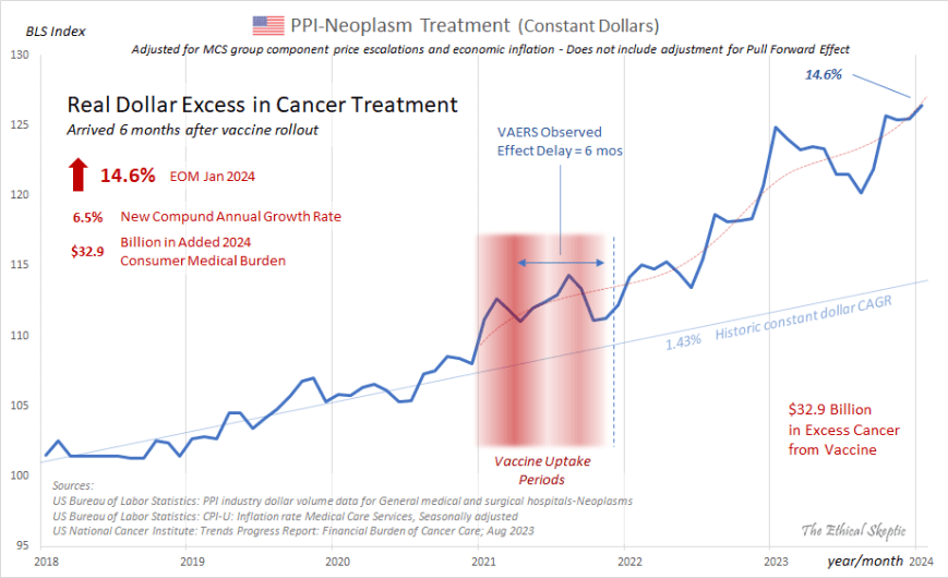
In corroboration of this alarming set of indices with regard to Cancer, is the constant dollar rise in expenditures for cancer treatment within the United States as of end-of-month January 2024. The rise in Producer Price Index-Neoplasm Treatment highlighted in Chart 7 below is adjusted for both inflation as well as its Medical Care Service (MCS) group price escalations (commensurate with CARES Act). The actual raw BLS figures show an even more aggressive increase than the 11.7% 14.6% indicated on top left hand side of Chart 7 below.
As well, this has been corroborated by other systems professionals replicating this same work.9
January 2024 Bureau of Labor Statistics revision raised last four posted months, and posts record for January 2024 – elevating excess cancer treatment real dollar growth (inflation and pricing adjusted) from 11.7% to 14.6% in just one month.
This stark rise in cancer treatment expenditures is corroborated by both the skyrocketing 2022/23 sales in cancer treatment drugs all across the board (save for sunsetting-lifecycle names), as well as the American Cancer Society’s Annual ‘Cancer Facts & Figures’ Report, which tracks cancer incidence by means of cases. The latter report (2024 is projected at the link provided) shows a clear 12.7% novel excess in cancer cases for both 2023 and projected 2024 (9.2% without pull forward effect), along with an increase of the cancer case growth rate from 1% to 2.7% CAGR (not influenced by PFE). These are depicted in Chart 7b below.
The rise in cancer in unequivocal.
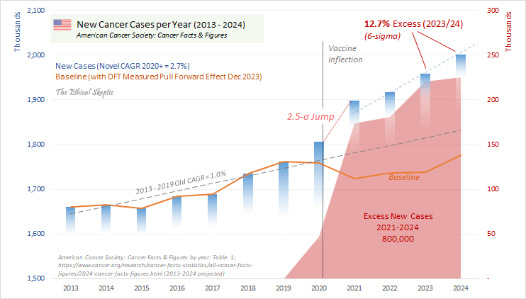
Little of this excess cancer is attributable to the ad hoc rescue of ‘a deferral in cancer screening appointments’, as cancer rates have soared in younger ages (see Chart 11), the biggest cancers dropped in incidence (by pull forward effect), while at the same time the diversity of cancer mix, as well as a 2022 spike in incidence of rare and secondary cancers, collectively serve to belie this notion.
USA Abnormal Clinical and Lab Findings Excess Mortality – 64%
The beige line in the chart below shows the CDC Wonder Abnormal Clinical and Lab Findings deaths per week for the four years prior, as well as latest year of the pandemic. The dotted baseline is normalized from the years 2014-2022, and ends with a pronounced (normal condition) hockey stick formation in the last 33 weeks of the timeframe depicted. The excess above this dotted line reflects excess mortality of uncertain cause (ICD code R99 in particular). As depicted in Chart 8 below, to date this comprises 39,800 concealed deaths.
As the astute analyst will notice, the peak weekly figure for Week 4 of 2024 had exceeded the old peak for Week 2 of 2023 (4,711 vs 4,604). Since this metric is also an excellent predictor of Excess Non-Covid Natural Cause Mortality (Chart 3 above), we are able to infer that the flattening from 2022 into 2023 observed in Chart 3 is due primarily to pull forward effect (PFE) and does not originate from a genuine reduction in vaccine-related deaths.
New Record Established = 4,711 deaths at peak hold period for 27 Jan 2024

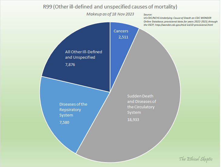
These deaths are broken out by type, in Chart 9 below. They comprise heavily, sudden, cardiac and circulatory deaths, as well as diseases of the respiratory system and cancers. The average age of this mortality cohort is 49 years old. These are not old people dying of Covid-19 nor Long Covid, they are dying from the mRNA vaccine – as it is clear that this excess began with the rollout of the vaccine in December 2020, as shown in Chart 8 above.
Before we broach the topic of our Deviation from Trend charts, it is helpful to remember that each of these charts feeds into the Chart 2 ‘Balance Sheet’ above – some charts show increases and inflections, other charts show nothing and/or decreases. Regardless, they do not constitute stand-alone conjecture. If one adjusts the parameters of these charts, then they lose agreement with the overall Balance Sheet depicted in Chart 2 above – and suddenly we have Covid or its mRNA vaccine fictitiously curing a whole host of diseases. One cannot tweak the analytics by means of stand-alone, trivial, or rhetorical critique – because they miss this type of inconsistency.
Every disagreement one brings to the table must be accountable to fit coherently inside the entire model – or it is merely an attempt to deflect, deceive, or push an uninformed opinion, and nothing more.
The following Deviation from Trend (DFT) charts, outlined in Charts 10, 11, and 12 below, are developed according to the linked Deviation from Trend Plot Procedure.
USA Sudden Cardiac Death Excess Mortality Ages 0-54 – 44.4% (21-sigma)
The blue line in the Deviation from Trend (DFT) chart below (Chart 10) shows the CDC Wonder Sudden Cardiac Death Mortality per week for the two years prior, as well as four years of the pandemic, for the age 0 to 54 bracket. The dotted baseline is normalized from the years 2014-2019, eroded by pull forward effect (PFE). As do many of the charts of this type (not in unaffected ICD sub-groups however), an inflection occurs at Week 14 of 2021. This is the impact of the mRNA vaccine. Note that we have redacted the final 25 weeks of this chart because that timeframe contains RXX ICD codes which artificially escalate in the final weeks (see Chart 8). So for conservancy’s sake we exclude these weeks from the analysis.
One should note that the mortality measured within this chart is not mortality related to aging-related heart disease. That grouping of ICD code mortality is actually down significantly (-28.3%). Do not let anyone equivocate between aging-related heart disease and sudden cardiac deaths in younger persons. In the latter we have a pronounced problem, which can be concealed by blending it with the PFE-impacted former. We caught the CDC using this trick in November 2023.
Note that this chart now includes ~300 ICD-X44 sudden cardiac deaths from casual drug use per week as of late 2023 (cited in Chart 4b). Note that this addition does not include fentanyl overdoses. Finally, note that the ‘climate change (X30)’ deaths only came into significant play around week 27 of 2023, so we are merely highlighting that for future watching.
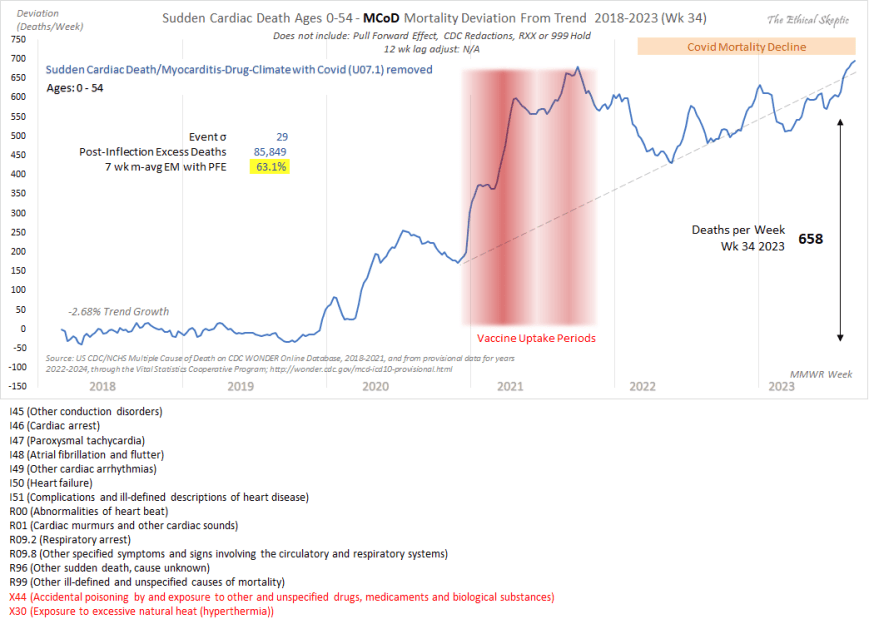
It is important to note that the Sudden Cardiac Death Mortality (without excess ‘unspecified drug (X44) and climate deaths (X30)) arrival curve depicted in Chart 10 above was confirmed, as to inflection, excess, and trend, by the Society of Actuaries in their Covid-19 Mortality Survey Report of November 2023. The full report can be accessed by clicking here.
USA Cancer Excess Mortality Ages 0-54 – 24.9% (12-sigma)
The blue line in the Deviation from Trend (DFT) chart below (Chart 11) shows the CDC Wonder Excess Cancer Mortality per week for the two years prior, as well as four years of the pandemic, for the age 0 to 54 bracket. The dotted baseline is normalized from the years 2014-2019, eroded by pull forward effect (PFE). As in many of the charts of this type (not in unaffected ICD sub-groups however), an inflection occurs at Week 14 of 2021. This is the impact of the mRNA vaccine. The soft increase which occurs in 2020 is dry tinder. These are individuals who died a couple weeks or months early, and as such, this data does not constitute actual trend data – unlike the data from 2021 and onward, which exhibits a strong and unqualified trend in this cancer mortality metric.
This has been corroborated by other systems professionals replicating this same work.10
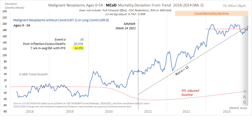
One possibly significant good news to note is that the growth in cancers for this younger age group has abated for the majority of 2023, wherein the metric has returned to its pre-2020 trend line. We will continue to monitor where this heads over the outyears.
USA All Non-Covid Natural Causes Excess Mortality Ages 0-24 – 25.5% (7-sigma)
The blue line in the Deviation from Trend (DFT) chart below (Chart 12) shows the CDC Wonder All Non-Covid Excess Natural Cause Mortality per week for the two years prior, as well as four years of the pandemic, for the age 0 to 24 bracket. The dotted baseline is normalized from the years 2018-2019, mildly eroded by pull forward effect (PFE – does not impact younger ages as hard). As in many of the charts of this type, an inflection clearly occurs at Week 14 of 2021. Just as in Chart 11 above, this too is the impact of the mRNA vaccine.
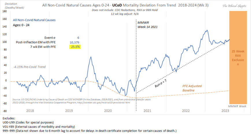
In similar fashion to Chart 10, we have chosen to exclude the final 25 weeks of this chart as well. These weeks include contribution from R99 mortality, which causes an artificial inflation of deaths during this period. As we observed in Chart 11 above, much of 2023 has been characterized by a return to the pre-2020 trend. We hope that this continues, but will monitor as we proceed forward.
Nonetheless, it is clear that we have a problem, and that problem is the Covid-19 mRNA vaccine. This serves to broach the question, just how deadly have the vaccine, along with all our other panic-fueled mistakes, indeed been? We answer that question in Chart 13 below.
USA Full Covid-19 Mortality Accountability – 1,257,300 Manmade US Deaths
The chart below shows the total impact of our poor decision making as a society, in terms of total mortality, and compares that mortality to the various wars and conflicts our nation has suffered. Of key note inside this death tally are the 706,036 deaths inside the Vaccine/Sudden/Long Covid tally. 95% of this metric resulted from the impact of the mRNA vaccine itself, with the remaining 5% attributable to primarily Long Covid.
Speaking with an actuary (40 years experience) at one of the largest insurance companies in the world saying the Mortality Statistics are being dramatically underreported and the actual numbers could be 10 times higher. The number of deaths by drug overdoses, suicides, homicides, traffic accidents, aggressive cancers (including colon cancers as young as 15), blood clots, myocarditis, enlarged hearts, strokes have dramatically increased since 2022.
~ Tony Seruga, Boardmember at Greenlaw Capital

Such is the state of things pandemic, week 6 of 2024, our 206th week of the SARS-CoV-2 Pandemic in the United States.
Vaccine 21 U.S. Code § 360bbb–3(c) Emergency Use Authorization forbade the availability of treatment outside a hospitalization context
see Influenza & Pneumonia (J09-J18) chart
Chat GPT-4: the terms “crude mortality rate” and “age-standardized mortality rate” are typically used for comparing death rates between countries under normal circumstances. These metrics may not be the most appropriate or informative when analyzing the impact of an unprecedented event within a single nation, as they can obscure the specific nuances and impacts of such an event.
When individuals express disagreement with the parameters or approaches I utilize in my models, it’s important to note that they enjoy the luxury of not having to substantiate their one-off contentions through the accountability of a coherent system in its entirety. This is exemplified in part by the ‘Balance Sheet’ in Chart 2 and the Deviation from Trend (DFT) inflections depicted in Charts 10 through 12 below – which all feed into a single coherent system involving thousands of hours in its development. I tend to be cynical regarding most disagreements from amateurs or even medical professionals, because these unqualified objections tend to be unaccountable, conducted in isolation, and serve to introduce incoherence into the overall model. Yet their proponent is conveniently and lazily unaware of this. They never circle back to see if their past claims were confirmed – rarely they do they turn out so. One can observe examples of egregious forms of fraud I caught inside this X-post thread or this X-post reply on the part of fake analysts promoting a pharma agenda.
A humorous example of this form of Simpson effect can be seen by clicking here. What becomes clear in this mock chart, is that if we employ the parameters which force sudden cardiac (Chart 10), cerebrovascular, and cancer mortality (Chart 6) to reattain baseline (as the pretenders insist is the reality) – and apply those same constraints to all the ICD-code DFT infeed charts in my system, suddenly we find that we have cured 23% of all human disease across 2.6 years. As it turns out, the constraints the pretenders want me to use, don’t work at all. They just operate under the luxury of not having to account for their unsound demands.
All the trolls had to do was wait, and see if my models proved correct. They did prove correct. But when you are spinning deception, you must declare truth early, often, and loudly. This is the heart of Narrative Science. Real credibility is earned by engaging in the meticulous and intensive work entailed in describing a system, not in running stand-alone stats, deceptive linear regression graphs, or academic poseur heuristics.
For instance, making the baseless or linear-extrapolated and lagged claim ‘There is no increase in cancer mortality’, in a vacuum, and not even knowing what an ‘MCoD’ or ‘Spring Lull’ is, constitutes an act of appeal-to-ignorance deception. So much more than pablum is required from these claimants – and no matter how much they scream and insist, they are still wrong (see Excess Cancer Mortality in Charts 5 and 6 below). In the realm of systems analysis, adherence to such a professional standard is paramount, and I make no apologies for upholding it.
ChatGPT-4: The terms “crude mortality rate” and “age-standardized mortality rate” are typically used for comparing death rates between countries in normal circumstances. These metrics are not informative regarding an unprecedented event within a single nation, as they serve to obscure the impact of such an event.
Senior Living: Life Expectancy Calculator; https://www.seniorliving.org/research/life-expectancy/calculator/
Senior Living: Life Expectancy Calculator; https://www.seniorliving.org/research/life-expectancy/calculator/
Senior Living: Life Expectancy Calculator; https://www.seniorliving.org/research/life-expectancy/calculator/
https://x.com/OS51388957/status/1750927706089291793?s=20
They want you dead.
Do NOT comply.






It took me 42 minutes to read this in it’s entirety and just an old special ed teacher. It’s well worth every second and is in no way TLDR. Ethical Skeptic has no doubt spent hundreds of hours pulling all this together. We NEED to take the 42 minutes to read it, then send it to as many people as possible.
Yes, and it is too long for me to thoroughly read in one sitting, but is exceedingly important. I try to digest and understand one section at a time.
Surely, the CDC and other agencies intentionally obfuscate. You have done much to make the proper conclusions clearer.